Saturday 6 December 2014

Lack Of Ground Space Leads To Rooftop Fields


The world is getting more and more populated with people, buildings, and technology ! Grounds are becoming scarce within cities and people are expanding outwards and upwards......I came across this picture recently of how the problem of space was solved !


TRACK FIELD IN CHINA


SOURCE:http://www.chinadaily.com.cn/china/2014-09/02/content_18529444.htm

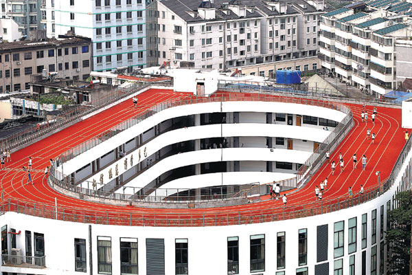
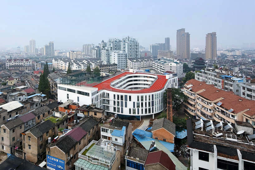
A primary school in China has its sports field on the roof due to lack of space on ground. The architects LYCS, incorporated a 200 m track along with a basketball court to its right.


SOURCE:http://www.designboom.com/architecture/lycs-architecture-tian-tai-no-2-primary-school-rooftop-running-track-china-09-29-2014/


FOOTBALL FIELD IN JAPAN


SOURCE:https://blogger.googleusercontent.com/img/b/R29vZ2xl/AVvXsEh9E4TN_TZnxXy4-u1QBy7BOU_EdtcWrqne8udT77-giLz8LAp3YqC8KX7tYz7wSfYtEHdXJoOgr4nIKREHuyYSeTOulBXKgnsQwRbipm2mNL1b8JIkCaMq9N8M5dO788SB1pnx9KW3AMw/s1600/Tokyo_rooftop_football-croop.jpg

A soccer field in Tokyo which sits atop a departmental store. 

GREEN ROOFS

This got me thinking on what else, roofs where being used as nowadays......


The  primary use of roofs are the purpose of climatic equalizer. It helps for insulation, energy conservation, generating electricity etc.

NANYANG TECHNOLOGICAL UNIVERSITY,SINGAPORE


        SOURCE:http://www.time-tolose.com/uploads/posts/2011-11/1322605761_green-roofs-33.jpg


Designed by CPG Consultants, it looks like a tarantula, closing its legs! Stereotypical to the Singapore buildings, it follows the green roof concept, but in this building, it looks difficult to figure out where the floor ends and the roof begins.The roof seems to dip at one portion where I assume the sunlight must be the most direct, generating heat to the maximum.


KAOSIUNG WORLD GAMES STADIUM,TAIWAN


  SOURCE:http://upload.wikimedia.org/wikipedia/commons/b/bc/WorkdGame2009_Stadium_completed.jpg

The roof is made of numerous scales of solar panels which help in solar generation and energy. Each of the panels are tilted at an angle to give maximum exposure to the sun.


 SOURCE:http://sites.psu.edu/kauman/wp-content/uploads/sites/4944/2014/02/Solar_panels_on_a_roof.jpg


Now even ordinary houses have solar panels installed on their roofs.I have seen many houses here, in Nottingham with these panels. In the night, they all seem to be glowing.


Nottingham Contemporary Vs. Wakefield Hepworth - A First Hand Experience

Researching art galleries for my project II, I went through many many galleries to see which galleries ticked with the people? How circulation worked ? The relationship between the people and the displays? the relationship between the people? The various display spaces, the exterior and the interior spaces,.....etc.
   
Nothing tells us more about spaces than actually visiting them and experiencing the Nottingham Contemporary Gallery and the Wakefield Hepworth Gallery  was an eye opener into the world of art and their spaces.


The Nottingham Contemporary sits on a corner of a completely Victorian setting architecture, with restaurants, a smallish plaza and a tram line on the side of it. Looking from the back side of the gallery, we see it sitting on a high pedestal along the skyline of the buildings as the site slopes downwards behind.


SOURCE : me


On the other hand ,the Hepworth Gallery sits on a quiet site that belongs solely for the purpose of  a building that would act as a landmark for the city of Wakefield. As you approach the gallery, it looks like a angular sculptural monument that is framed by water and landscaped on the other side. It was like a beautiful piano composition with the right balance of harmonies!


SOURCE : me


Entering into Nottingham Contemporary, the entrance is emphasized by a projecting canopy, which leads into a lobby with the reception and a whole lot of books and other sale-able items....and leading to the galleries.
   The first thing I noticed about the arrangement of the galleries was that the lobby leads to three gallery spaces named Gallery 1,2 and 3. I feel the problem with choice in a gallery is that, you tend to miss out or may avoid one of the galleries if you are bored and galleries are places where you come to see art and thereby visit all the displays. One more unavoidable fact was that , I had to keep coming back to the lobby space to enter into the other galleries.

                                                                                         SOURCE : me


 The Hepworth Gallery has a clear circulation within.There is a main axis from the entryway to the stairs leading to the galleries above.It was simple and clear ,for me to know where to go from the entrance.The reception led to the other rooms like the shop and the workrooms,the toilets and the cafe etc which were all across from each other ,thereby giving clear sight lines between the spaces.I felt that the Hepworth was way easier to navigate.


 SOURCE : me


The galleries in the Nottingham Contemporary had a main breakoff space (lobby) which connected to each of them individually. Some of the spaces were connected to each other while others could be accessible only by coming back to the lobby.The display spaces were huge rooms with white bland walls where, the only source of light was from the skylights above.There was no connection to the outside from the galleries except for one of them which had a glass wall looking through to the entryway and into the entrance outside.

                                                                         SOURCE : me

While , in the Hepworth, there is a processional pattern of movement between galleries. There is only one entry and exit point, so you do not tend to walk into the same spaces again , hence, making sure you visit all the rooms. I really liked this passage , because there was a natural flow from one gallery into the other and I did not even realize that I had reached the end! There was also a variation in height of the rooms,giving me a feel of different quality of spaces from intimate to public.


There were also beautiful picture windows that framed the outside views at strategic points. The architect made sure that the magnificient surroundings were not wasted from the inside.


Looking at the fascade of the Nottingham Contemporary , I got the feeling that the architect was trying too hard to make the building stand out. The green concrete texture and the gold glossy , shine metal created an odd combination that was further enhanced by the convex form of the surface. It looked like a last minute attempt to connect the gallery with the surrounding history. The lace pattern was barely visible unless standing very close.


The Hepworth , meanwhile, was a monolithic block of sculpture made of grey concrete stone.


Overall,I felt that the Hepworth Gallery was a more ideal design for a gallery compared to the Nottingham Gallery , due to its easy circulation , its setting and the maximum use that the architect made of the surrounding context,therefore not overpowering the building with respect to its surrounding , but finding that right balance between the two.


Friday 5 December 2014

Tado Ando - Architecture At Its Rawest

Tadao Ando, is a Japanese architect who's background has nothing to do with architecture. This may have been the main reason, for shaping his raw and minimalist style. Being self -taught, all his work has a clean and simple design that evokes a sense of awe in all his buildings.

CONCEPT

He gives great importance to the play of light and shadow in all proportions. From small openings to linear to circular, he's tried it all. He's mastered the use of sunlight in his work , which emphasizes the other elements of his design. His use of concrete , gives an unfinished look yet a polished feel to his interior spaces. The core of his design is the connection and experience that the visitor feels to the function of the space like his famous Church Of light (my personal favorite), Modern Art Museum, Church On Water.....and many more.

"When I design buildings, I think of the overall composition, much as the parts of a body would fit together. On top of that, I think about how people will approach the building and experience that space."- Tadao Ando


SOURCE:http://www.arcspace.com/features/tadao-ando/sayamaike-historical-museum/


SOURCE: http://www.modernnow.com/tadao-ando-sketches-for-the-modern/

sketches by ando
                                       
CHURCH OF LIGHT:

This is a masterpiece by Ando that shot him to fame an an architect. He has used the essence of the christian cross, not through a physical element but through the play of light. Form and function have been balanced out beautifully in this building where neither overpowers the other. You feel an utter sense of calm, when you enter the building, which is just one huge room, high ceiling and dim. The main powerful lighting is from the cross shaped opening on the wall facing the seating.


SOURCEhttp://architectsimet.com/2013/11/04/san-francisco-i-en-i-joanne-duka/
   
SOURCEhttp://mela.iuav.it/blog/wp-content/uploads/2012/09/church-of-the-light.jpg


Looking at this picture, I get the feel that the cross stands prominently with the only source of light coming form it.The space is narrow as well as high, giving it a sense of vastness, reaching for the skies. It makes me want to sit and contemplate without any distractions due to its lack of colour and simplicity.
I guess the meaning of the cross goes, during nightime, due to the lack of natural light.


SOURCEhttp://www.moma.org/collection/object.php?object_id=339


                                          SOURCEhttp://www.architravel.com/architravel/city/osaka/


For my current design studio project, we were asked to design an art gallery. My inspiration was Ando. Many of his interior spaces, held my attention and created an impression on me ....... 


SAYAMAIKE HISTORICAL MUSEUM,JAPAN


I loved this passage, on the side of which water from the overhead body fall along its side.


SOURCEhttp://www.arcspace.com/features/tadao-ando/sayamaike-historical-museum/


SOURCEhttp://archintern.tumblr.com/post/63040733824/tadao-ando-a-lesson-in-experience-design-tadao

LANGEN FOUNDATION,US :


Use of a strip light to highlight the passage to the main display across.


SOURCEhttp://abduzeedo.com/architect-day-tadao-ando

CHIKATSU-ASUKA MUSEUM,JAPAN :


The narrow staircase gives a sense of mystery 

SOURCEhttp://www.architravel.com/architravel/architects/tadao-ando/

A- CHAIR :


                  SOURCEhttp://sv204.xserver.jp/~cd-inc/concept-design.jp/shop/D64690497.jpg

Similar to his style,the chair shows prominence in scale and simplicity.The colour is also plain and monochrome.


One of my favorite architects of all time, I feel Tadao Ando's style is the true meaning of Mies Van Der Rohe's "Less Is More" saying !